Call us at 1-877-446-7746
4imprint Product Reviews
We believe our products deliver results—
but you don’t have to take our word for it. See what real customers say about the items they’ve ordered and find the promotional products that work for you.
Quickly Navigate the Page:
Newest Product Reviews
50 newest reviews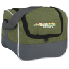
Chic Lunch Cooler Bag
Item No. 129495
Kelly from Tucson
The lunch pails are really nice and roomy. Allows plenty of space for any size Tupperware and extras. It would probably fit a 6-pack of soda comfortably.
read all 8 reviews for Chic Lunch Cooler Bag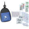
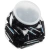
Mini Backpack First Aid Kit
Item No. 160346
Kelly from Tucson
These kits are super cute
read all 6 reviews for Mini Backpack First Aid Kit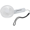
Mini Breeze Rechargeable Hand Fan
Item No. 164292
Kelly from Tucson
This is a huge hit and will be a great handout for the summer.
read all 9 reviews for Mini Breeze Rechargeable Hand Fan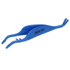
Tick Removal Device
Item No. 160088
Kailene from Dover
Does what it needs to do.
read all 1 reviews for Tick Removal DeviceTop Rated Products
100 highest rated products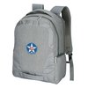
Reviews and Ratings of New Products
Ratings of our newest products
Top Rated Products by Category
Top items in each categorybanners, flags & signs
document holders
presentation folders
executive toys

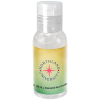
hand sanitizers
Most Reviewed Products
Top 50 most reviewed itemsJavelin Pen
read all 991 reviews for Javelin Pen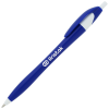
Item No. 6551
Patti from Hillsboro
Excellent Quality!
Karen from Sparta
Perfect for our everyday office pens
Belinda from Vienna
Very nice pen to use to give out at Job Fairs and to visitors.
Bic Clic Stic Pen
read all 608 reviews for Bic Clic Stic Pen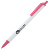
Item No. 39152
Steve from San Marcos
Great pen!
William from Boulder
Thank you for the assistance and the great pens! Perfect all the way. I apreciate you all!
Vince from Dieterich
Great Price & Great Quality
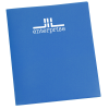
Serged Closed-Back Table Throw - 6 feet
read all 540 reviews for Serged Closed-Back Table Throw - 6 feet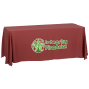
Item No. 2212
Melissa from Grass Valley
THRILLED with the service and quality from 4Imprint, as always!
Todd from Kirkland
happy with the result
Cynthia from Brooklyn
Amazing product, very thankful it came out just the way the organization envisioned!
Top Reviewers
Reviews from our top 50 reviewersLindy from Bronx
read more reviews by Lindy from Bronx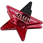
Mighty Clip - Star
Item No. 5897-ST
Healthcare workers who usually go for hearts absolutely love these stars. They are great for magnets or keeping opened bags closed. Will order more,
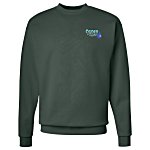
Hanes ComfortBlend Sweatshirt - Embroidered
Item No. 101581-E
I loved these so, I kept 3 for myself.
Jennifer from Oxford
read more reviews by Jennifer from Oxford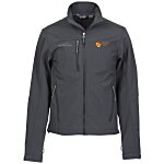
Eddie Bauer Soft Shell Jacket - Men's
Item No. 116566-M
A quality coat, ordered blue and black. Everyone loved them. Also ordered the ladies version.
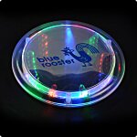
Light-Up Coaster
Item No. 118445
Fun item. I haven't had any problems with them at all. Colors LED's are bright. Would be a nice giveaway for a bar or restaurant.